Interactive portfolio / 2026
A purpose-driven design studio, strategy first.
Work that had a job to do: fill a booth, lift a conversion rate, hand a marketing team a system they can run without us. Everything below plays, clicks and moves the way it shipped, so you can judge it the way your audience would.
Strategy first, then design. From moodboard to story to production, since 2022
Slingshot Bio
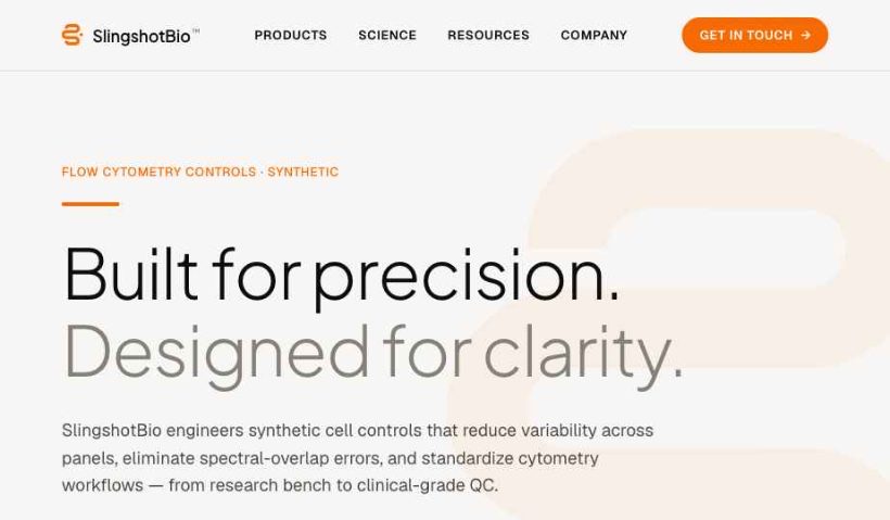
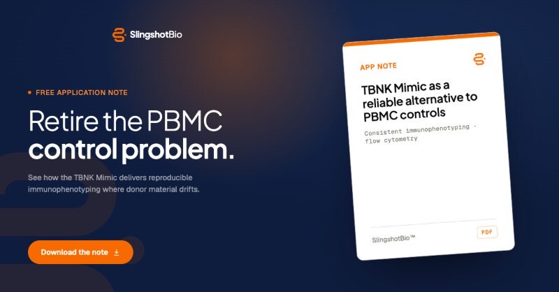
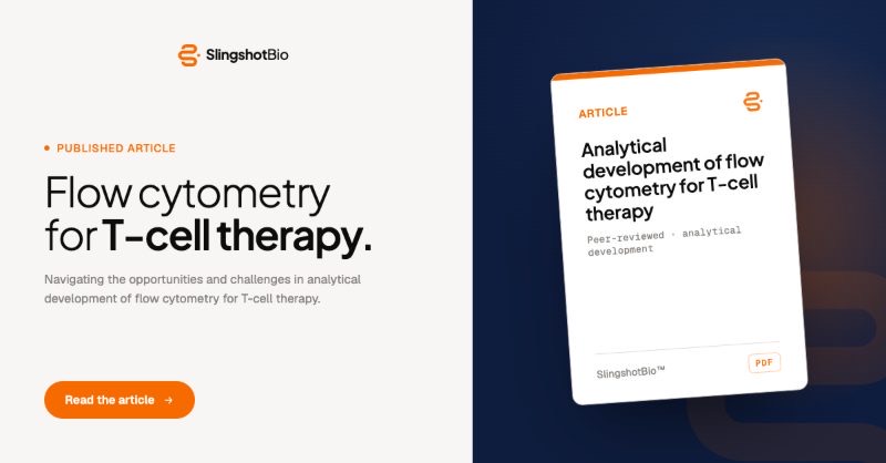
AI-native atomic design system · 2026Brand guidelines go stale the day the PDF exports. For Slingshot Bio we built the alternative: an atomic design system made to be operated by AI agents (tokens, machine-readable rules, components and embedded workflows) so every future asset, made by anyone or anything, lands on brand without a review cycle. It's the difference between documenting a brand and making it self-enforcing. Below is the actual system running in this page — operate it yourself.
the whole page re-themes
PRECISION DIAGNOSTICS
Built for precision. Designed for clarity.
Single-molecule sensitivity in a workflow your lab already knows — validated, documented, ready for scale.
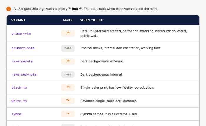
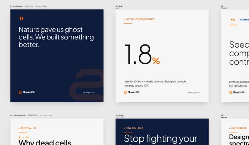
The atomic architecture
{{ n.num }}
{{ n.name }}
{{ n.sub }}
Ask it anything — it answers in brand
Concord Technologies × HIMSS 2026
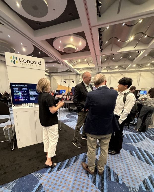
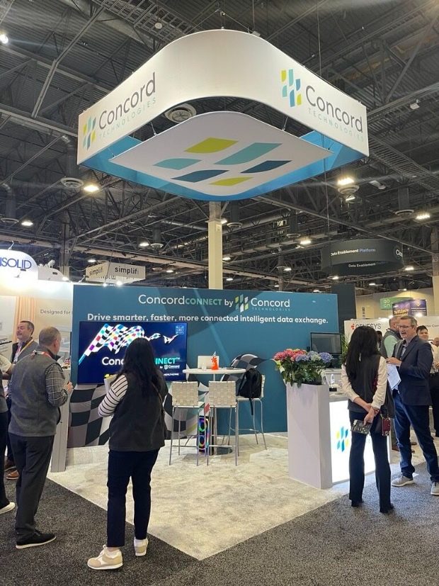
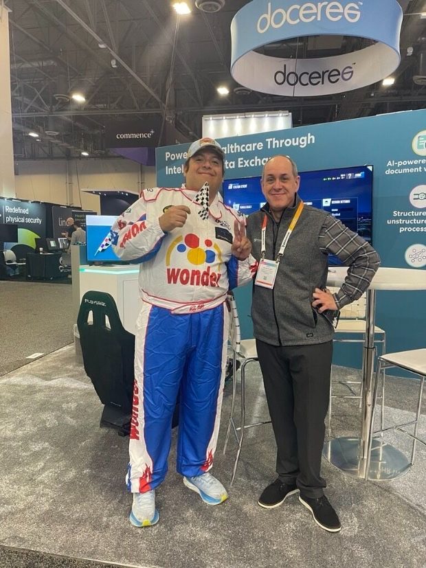
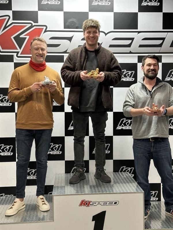
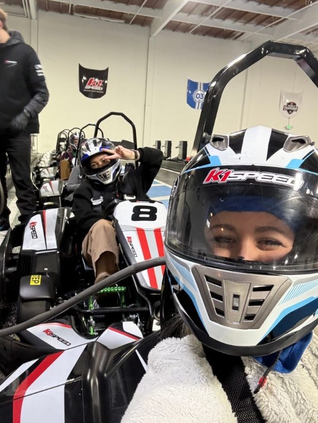
Interactive product demoHealthcare IT buyers walk the HIMSS floor believing admin burden is unavoidable and "intelligent automation" is marketing language. For Concord's Booth #1461 (HIMSS 2026, March 10–12) we built the campaign to change that belief on the spot: a Formula 1 racing theme carried forward from previous years' campaigns (evolution, not replacement, compounding recognition the earlier work had already earned), wrapped around a Simulator Challenge and a Pit Stop Happy Hour that pulled traffic to the booth. The strategic move was ours: we recommended replacing static product screenshots with a live UI prototype and motion demo (Figma + ScreenStudio), and the client approved. Design partner work, not execution vendor work. Press play below; this is the deck's real motion, exported straight from the deliverable.
Engineered like a product, not a slideshow: built to survive 30+ live demo repetitions over three days on booth hardware with zero failures, and scripted so any presenter, not just the product expert, could hold the room. Eight deliverables, production-ready, on deadline.
On the HIMSS floor
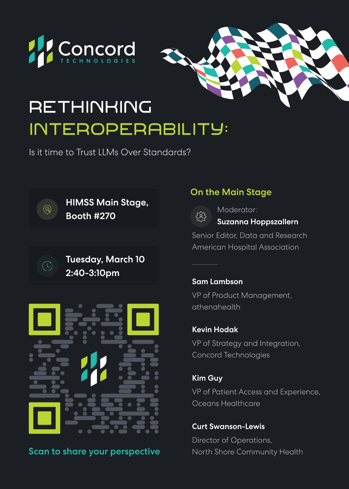
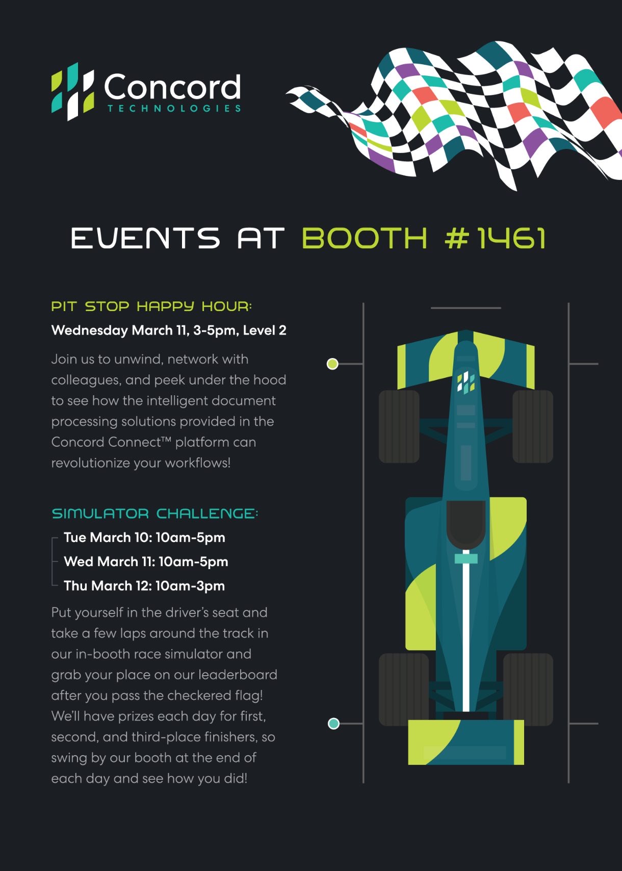
Event collateral — the dual-sided postcard
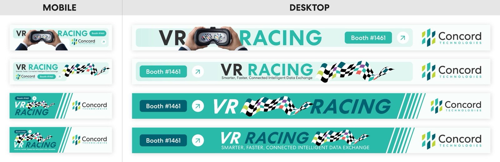
Conference app banners — one teaser sequence, every placement
Cirkul
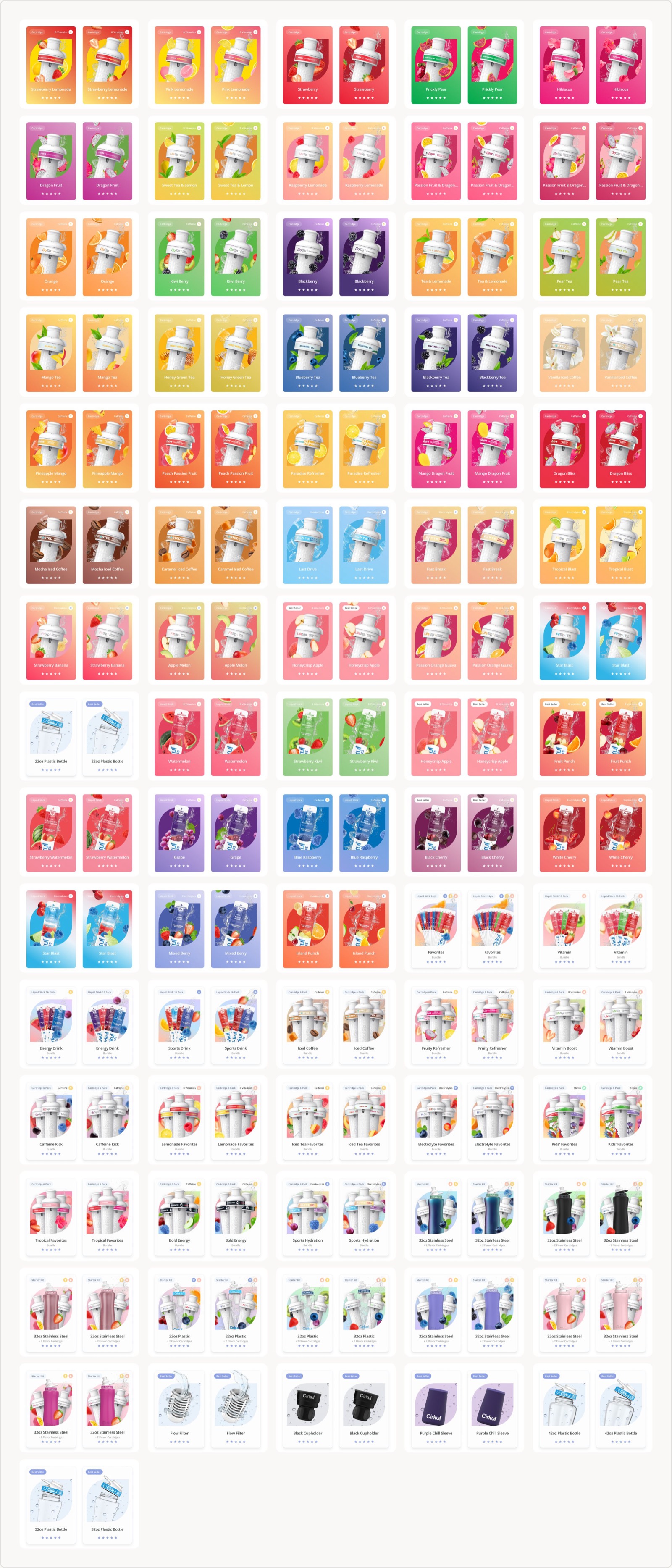
Production animation · 2026225 product cards is not a design problem, it's a production problem. We solved it once, with one card system, one animation language and one pipeline, so every new flavor or bundle drops in without redesign. Shipped web-native as Lottie: crisp at any size, light enough for a storefront, and still on brand at card #225. Sixteen play live below.
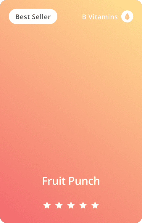
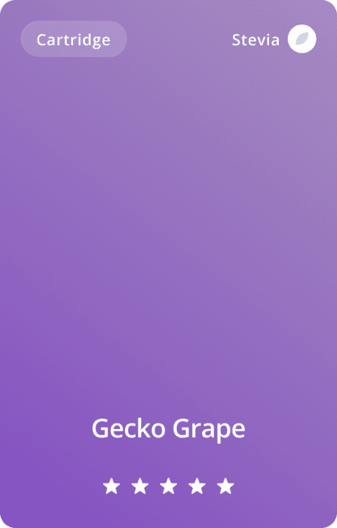
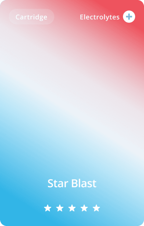
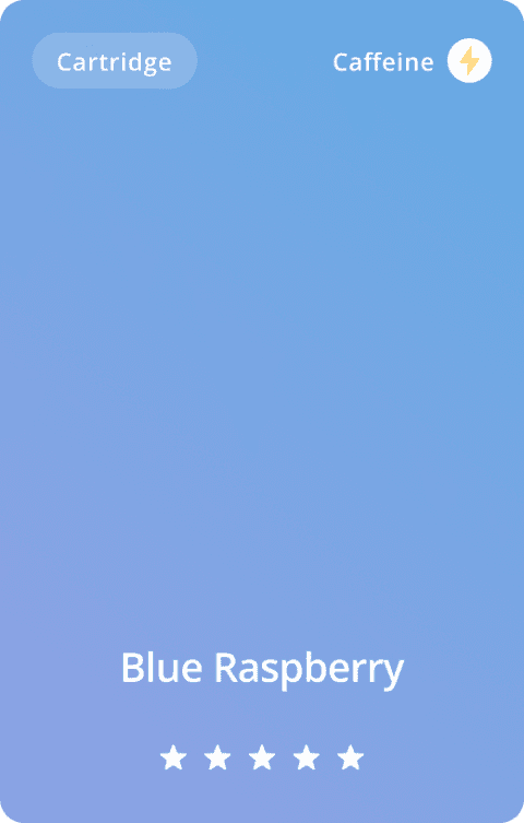
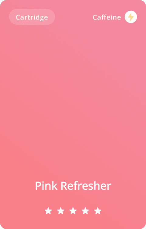
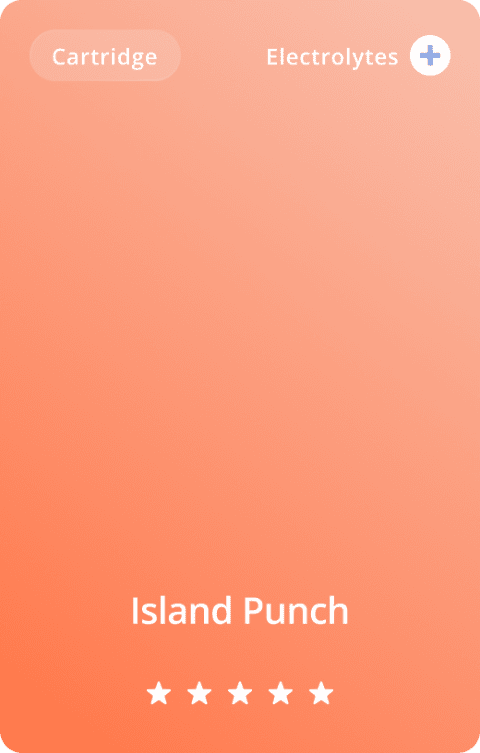
hovertap a card to play — flavors, protein bundles, bottles and kits from one pipeline
The scale — the full production run
Where it started — website hero concepts
Inovalon × Empower 24
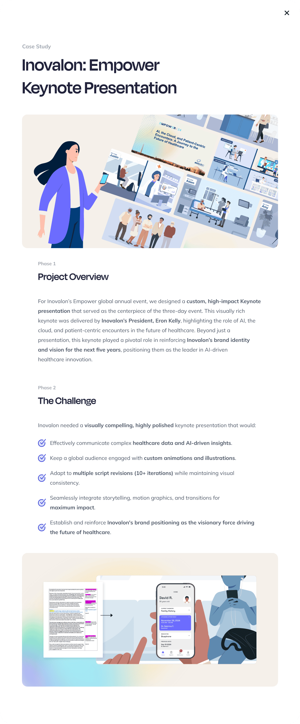
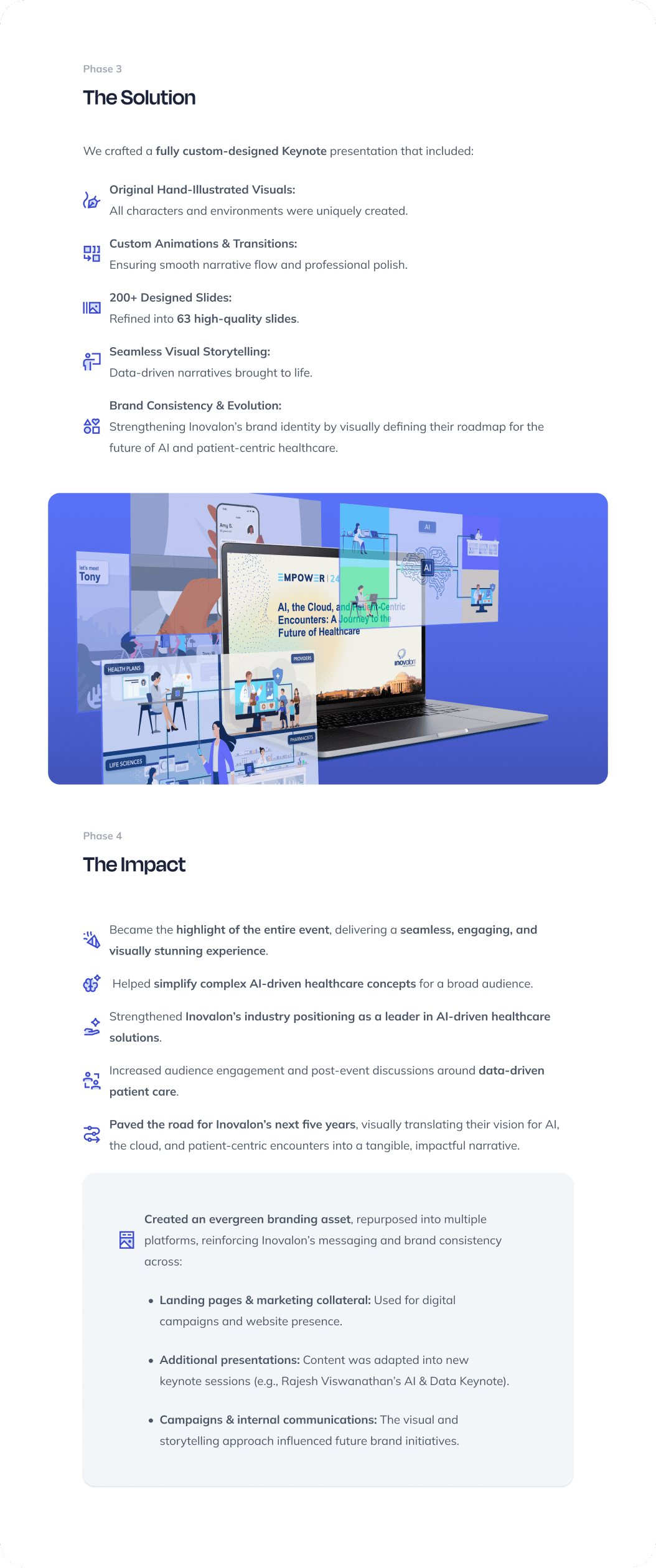
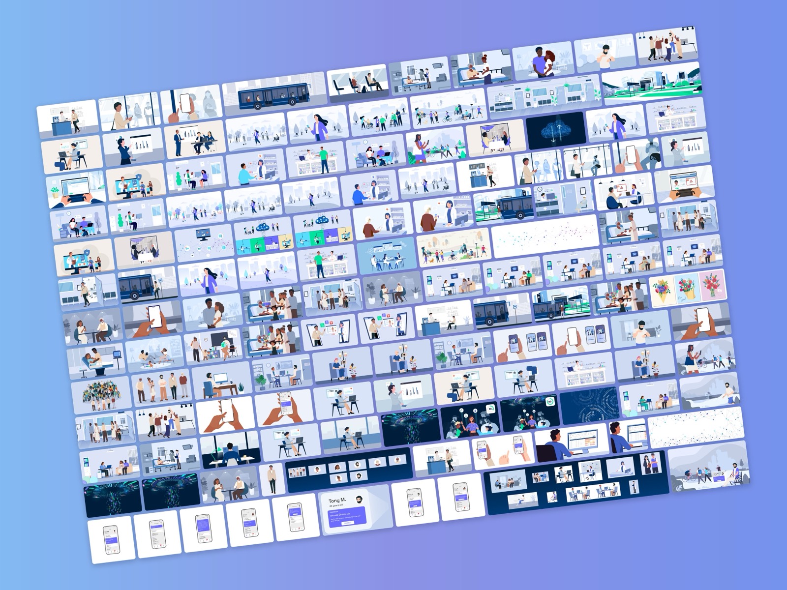
Keynote presentation · 2024Great presentations don't just inform. They captivate, inspire, and drive impact. For Inovalon's Empower 24, the company's annual healthcare summit, we designed the keynote President Eron Kelly delivered as the centerpiece of the three-day event: "AI, the Cloud, and Patient-Centric Encounters: A Journey to the Future of Healthcare." It was built from scratch, with original hand-illustrated characters and environments and custom animation throughout, so a dense story about data, AI and the cloud could be told as a day in the life of a patient instead of a stack of bullet points.
Beyond the stage, the keynote played a pivotal role in reinforcing Inovalon's brand identity and vision for the next five years, positioning the company as the leader in AI-driven healthcare innovation. 200+ designed slides were refined into 63 and held their visual consistency through 10+ script revisions, then the same system was carried onto the stage screen, the lightbox cube, the event collateral and two event websites. A testament to the power of design-led storytelling in enterprise presentations.
Watch the full keynote on Inovalon's channel ↗
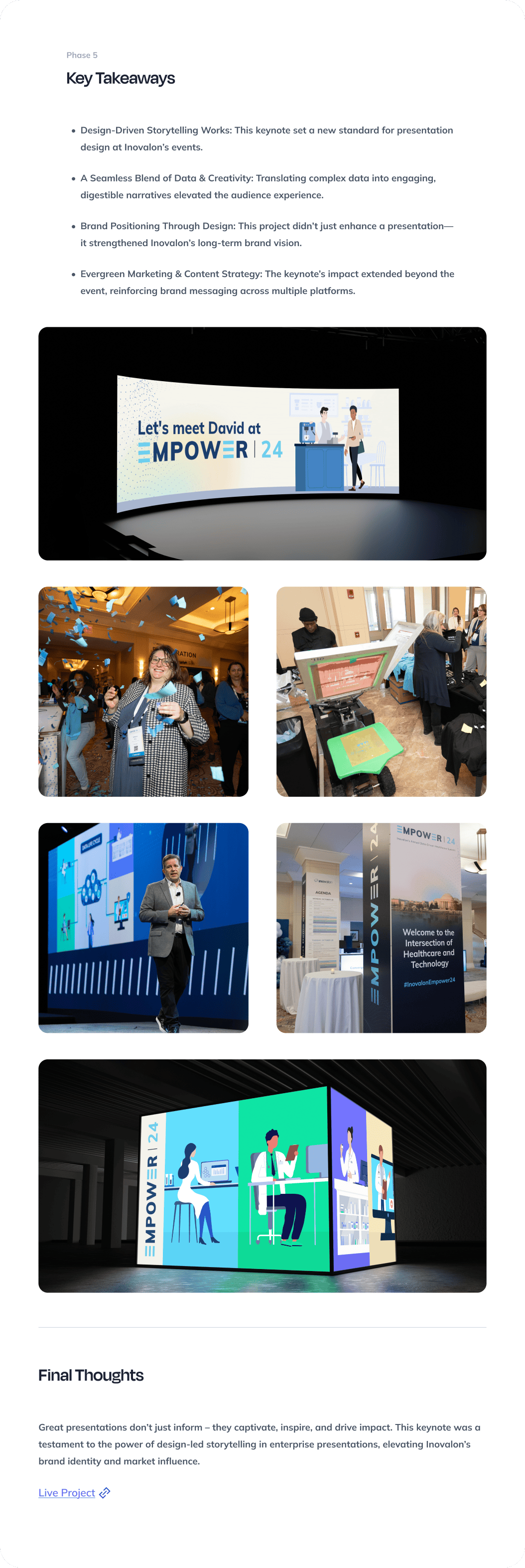
170 artboards
“Last year, we had a production company make everything from scratch in Keynote… This year, you are our ‘from scratch’ production.”
The event sites
Both Empower event sites, designed to carry the keynote's look from first visit to registration: agenda, speakers, venue, ticket tiers and on-demand video from the prior year.


“I love what you did with the why attend section to be more visual!!”
Inovalon
Product marketing · 2025–2026Enterprise marketing teams don't need more one-off assets — they need systems they can run without a designer in the loop. For Inovalon we build both layers: campaign landing pages and HTML email that ship on deadline, and an approved template catalog underneath (event invites, one-pagers, product sheets, webinar decks) that their internal team executes from daily. The work below is what "evergreen" actually looks like: foundations that keep producing after we hand them off.
Landing page work
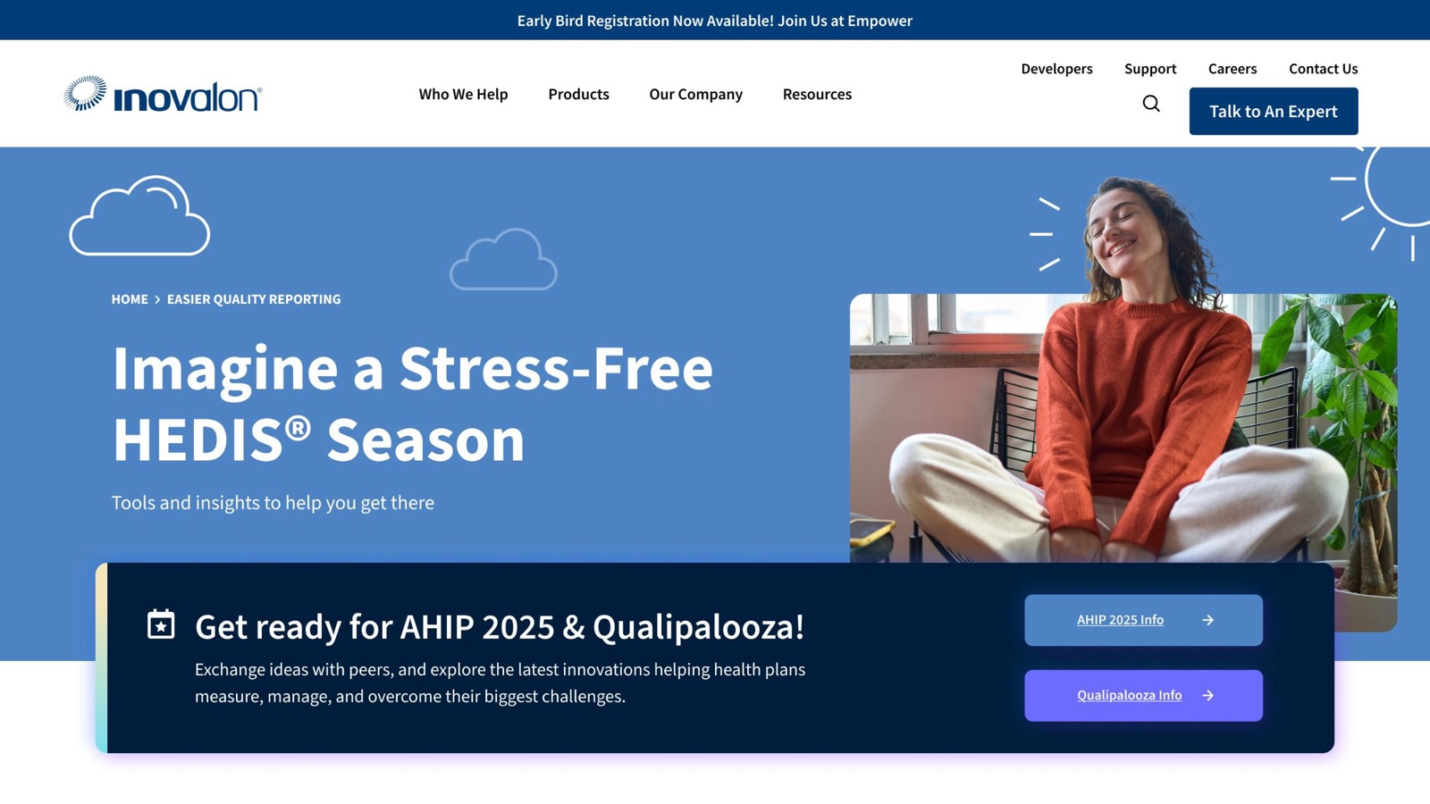
Solve Your Biggest HEDIS Challenges
Explore the real-world challenges health plans face during HEDIS season, and how we act as your extra set of hands to solve them.
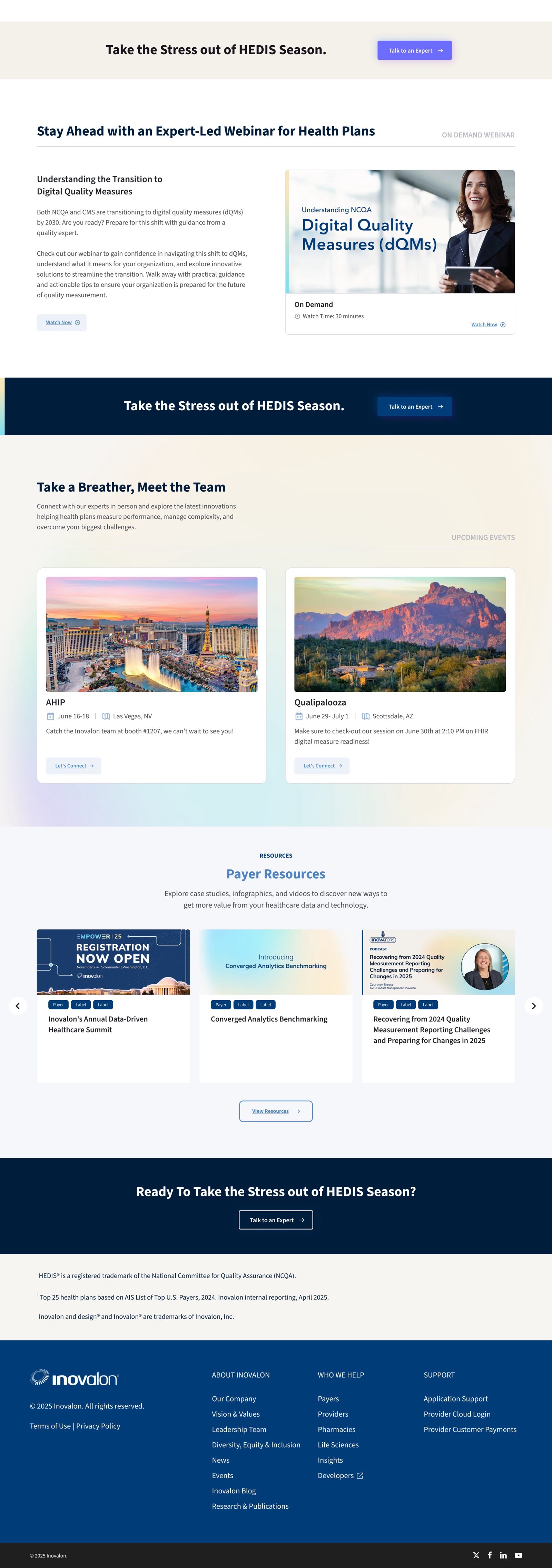


The approved template system
Event invites, one-pagers, product sheets, a long-form infographic and a webinar presentation template, each in approved A/B options the internal team runs from a shared content template catalog.
H.I.G. Capital
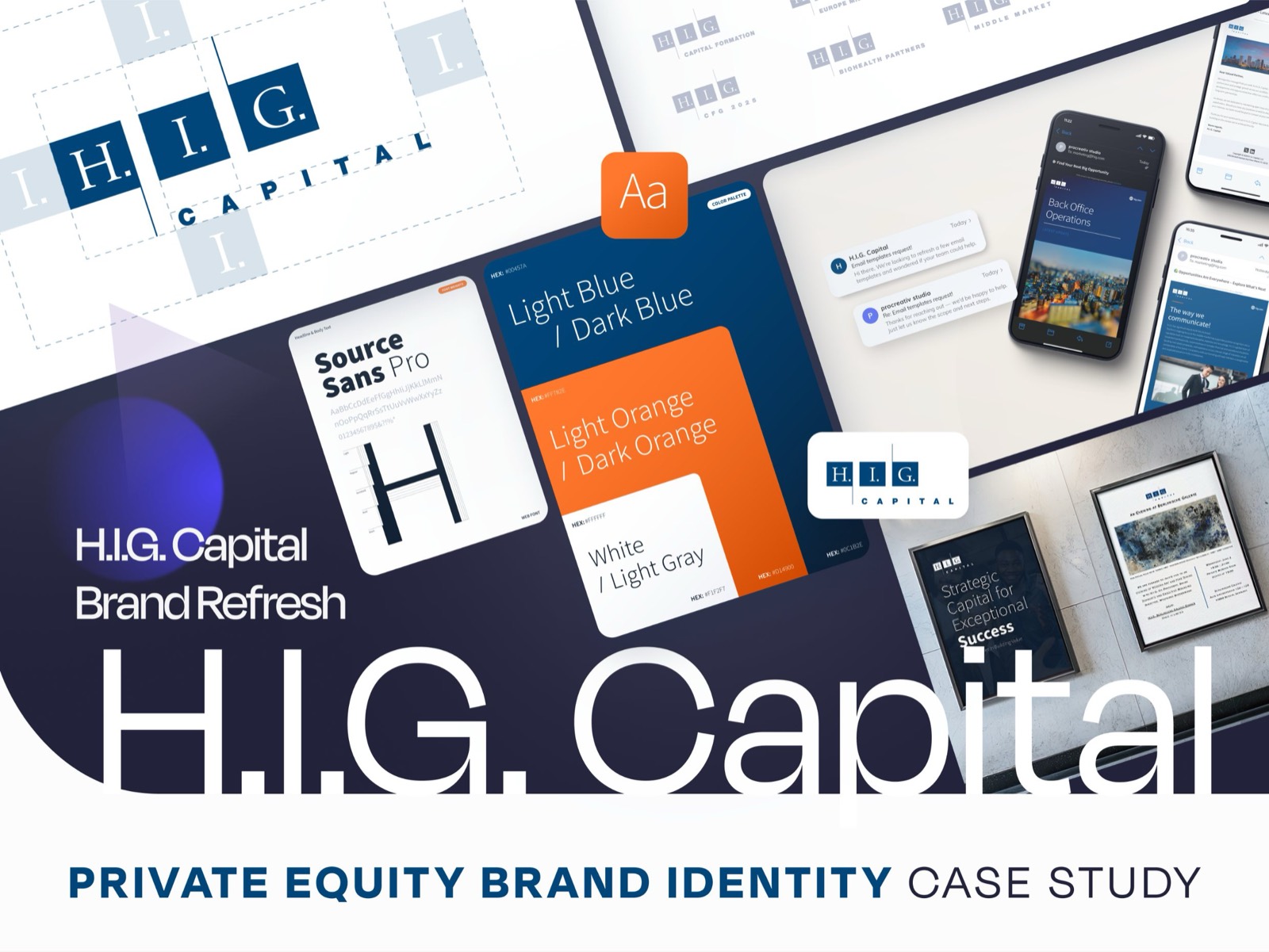
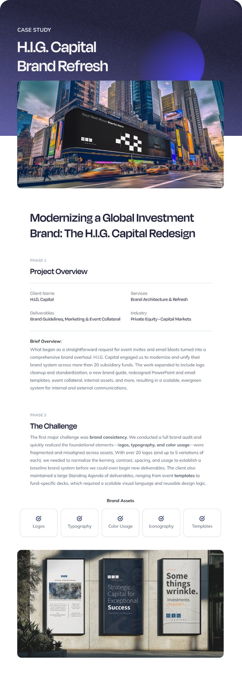
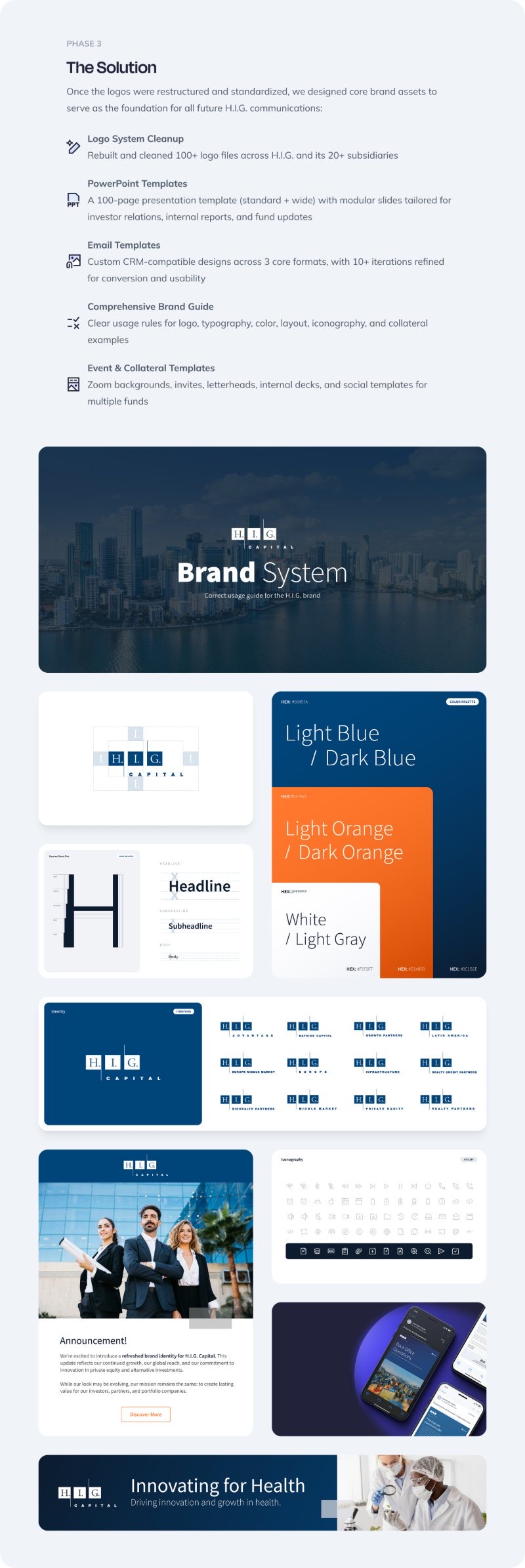
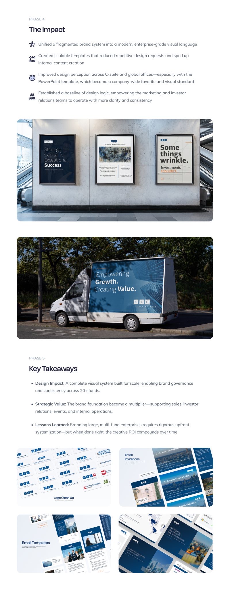
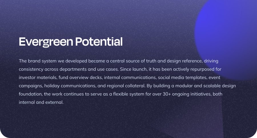
Ongoing since 2023It started as an event-invite request. We saw the real problem, a brand fragmented across 20+ subsidiary funds, and made the case for fixing it at the root. The result: 100+ logo files rebuilt into one coherent system, a new brand guide, and a 100-page PowerPoint template that put on-brand output in every employee's hands. That's the pattern we work in: enter through the task, deliver the system.
Vroozi
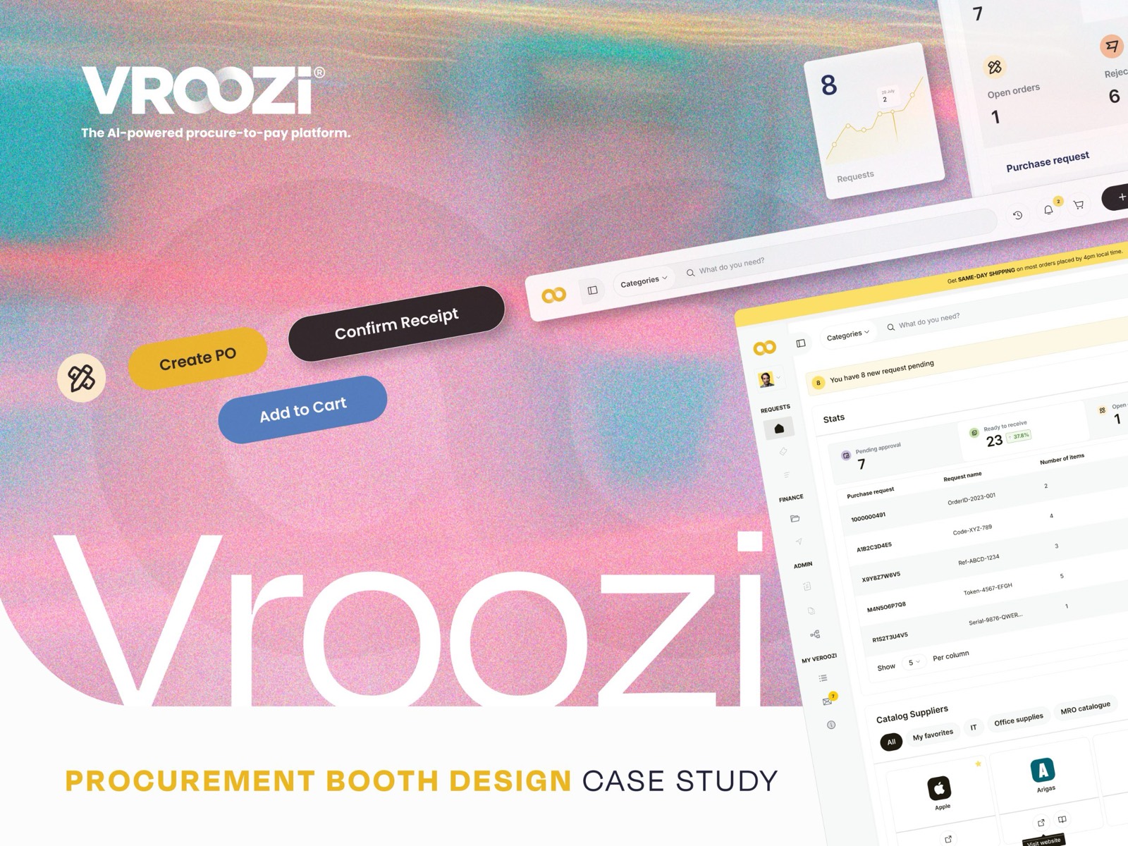
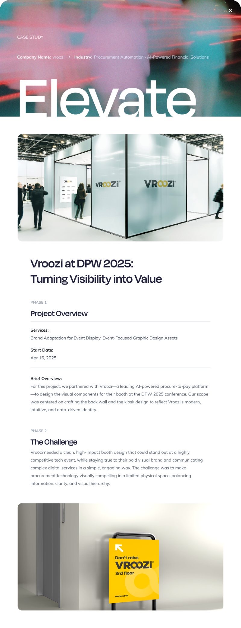
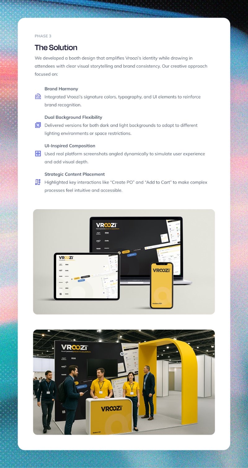
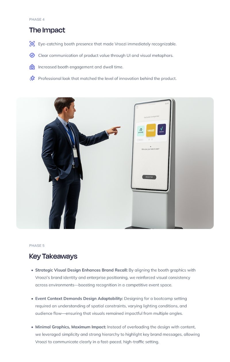
Trade show booth · 2025A trade-show booth has one job: stop the right people mid-stride. For Vroozi at DPW 2025 we designed the full physical presence (back wall, kiosk, event collateral) as one visual argument for the platform, and carried it from concept through production files the fabricators could build from without a single clarification call.
Evan Levine Real Estate
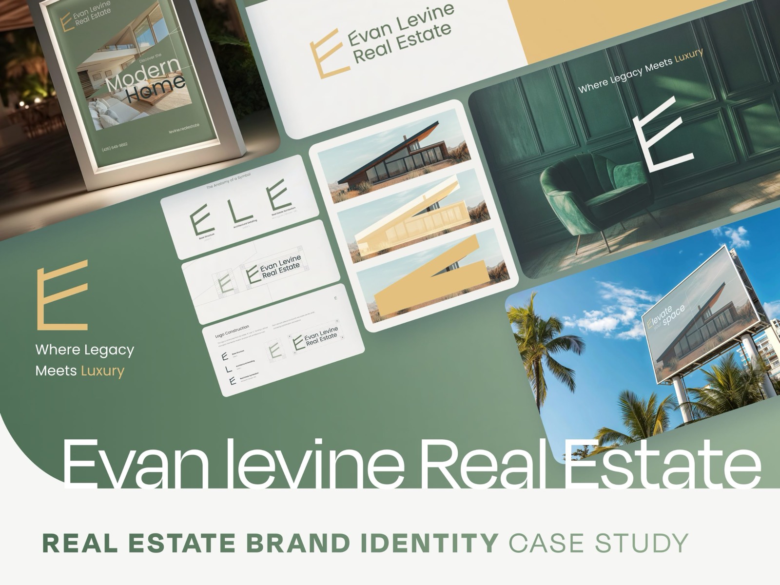
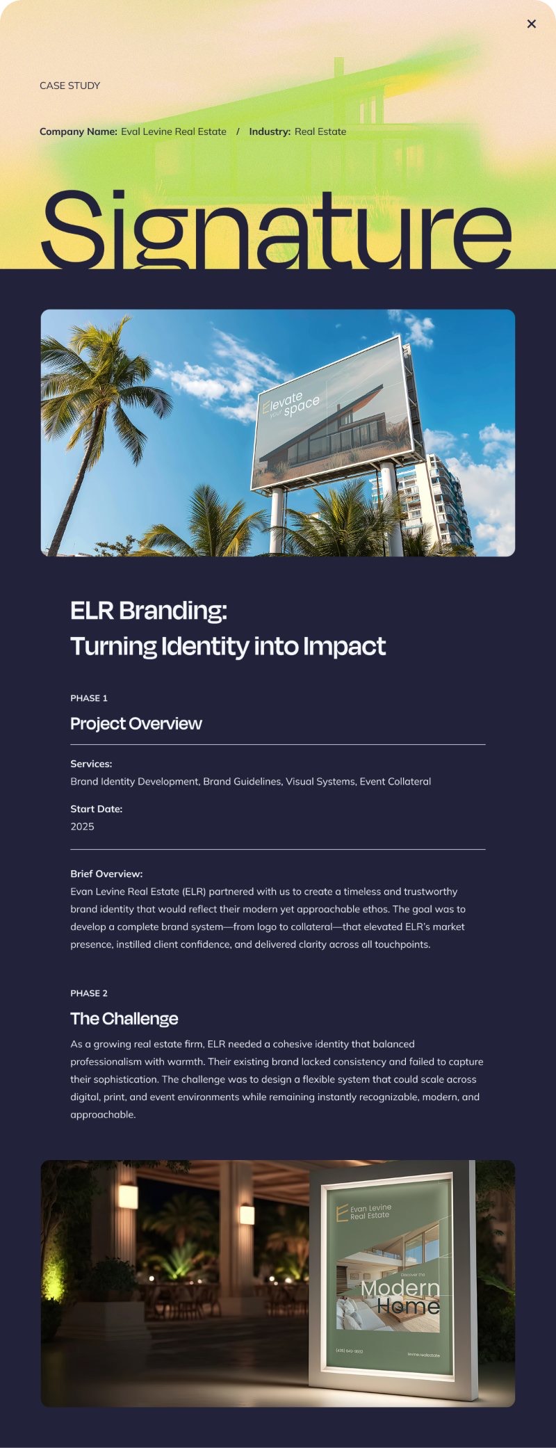
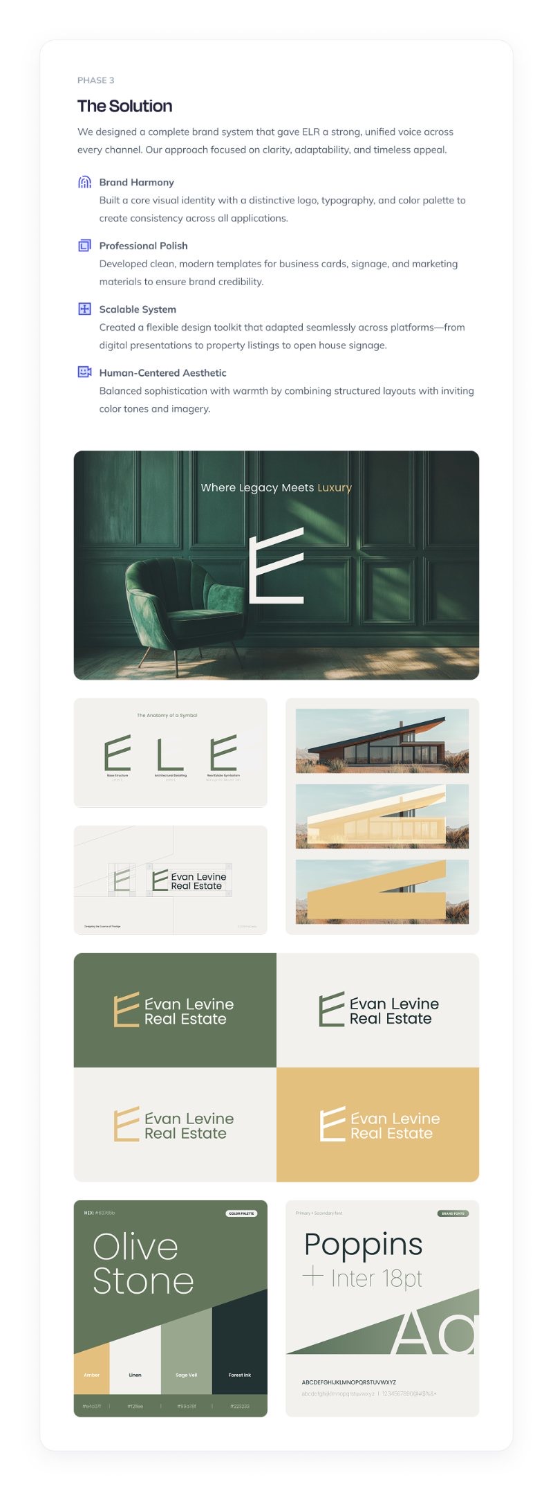
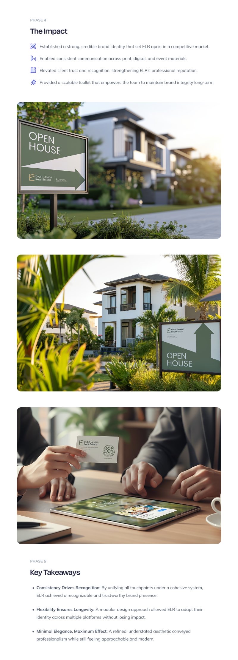
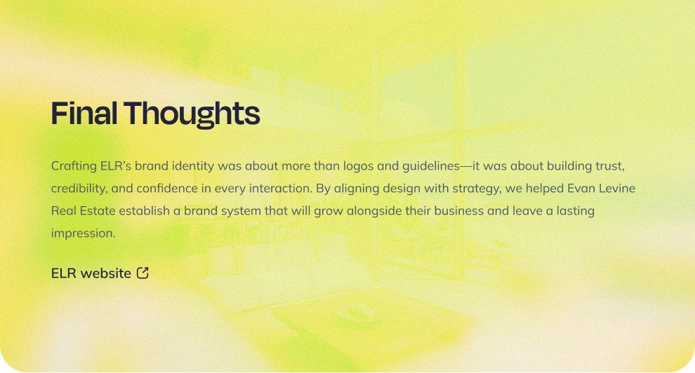
Brand identity · 2025A Park City real estate practice competing on trust needed an identity that signals it before a word is spoken. "Where Legacy Meets Luxury" became a complete system of logo, color, type, signage, cards and collateral, built on foundations deliberate enough that every future touchpoint, from a yard sign to a listing deck, extends the brand instead of diluting it.
Fictiv
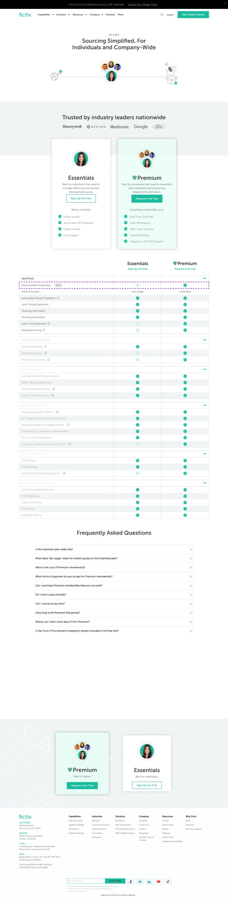
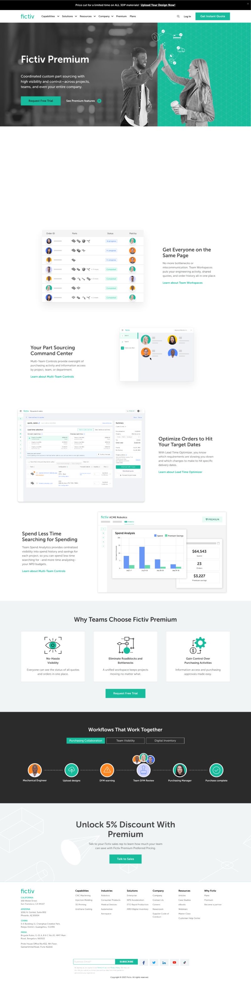
Web experience & motion systemsFictiv kept us for years because the work paid for itself: every redesign shipped as an A/B test, so design decisions were settled by conversion data, not taste. The navigation system below, the interaction work shipped to production, lifted signup conversion by roughly 40%. Around it: page revamps, pricing and launch pages, all drawn from a shared UI kit we maintained so velocity never came at the cost of coherence.
Pages shipped across the engagement
Homepage A/B tests, the procurement-integration launch, pricing and plans, and a ground-up revamp of the CNC Machining page (desktop and mobile), all built on the shared UI kit.


“The new navigation menu popped off!! We saw about a 40% improvement in our website conversion rate to platform signup with the new design. One of the fastest winning designs we’ve had to date.”
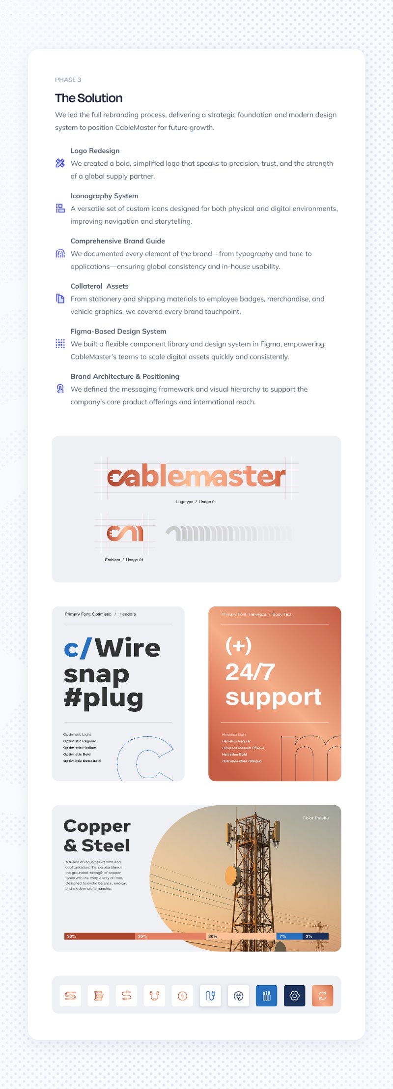
CableMaster
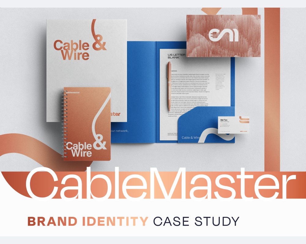
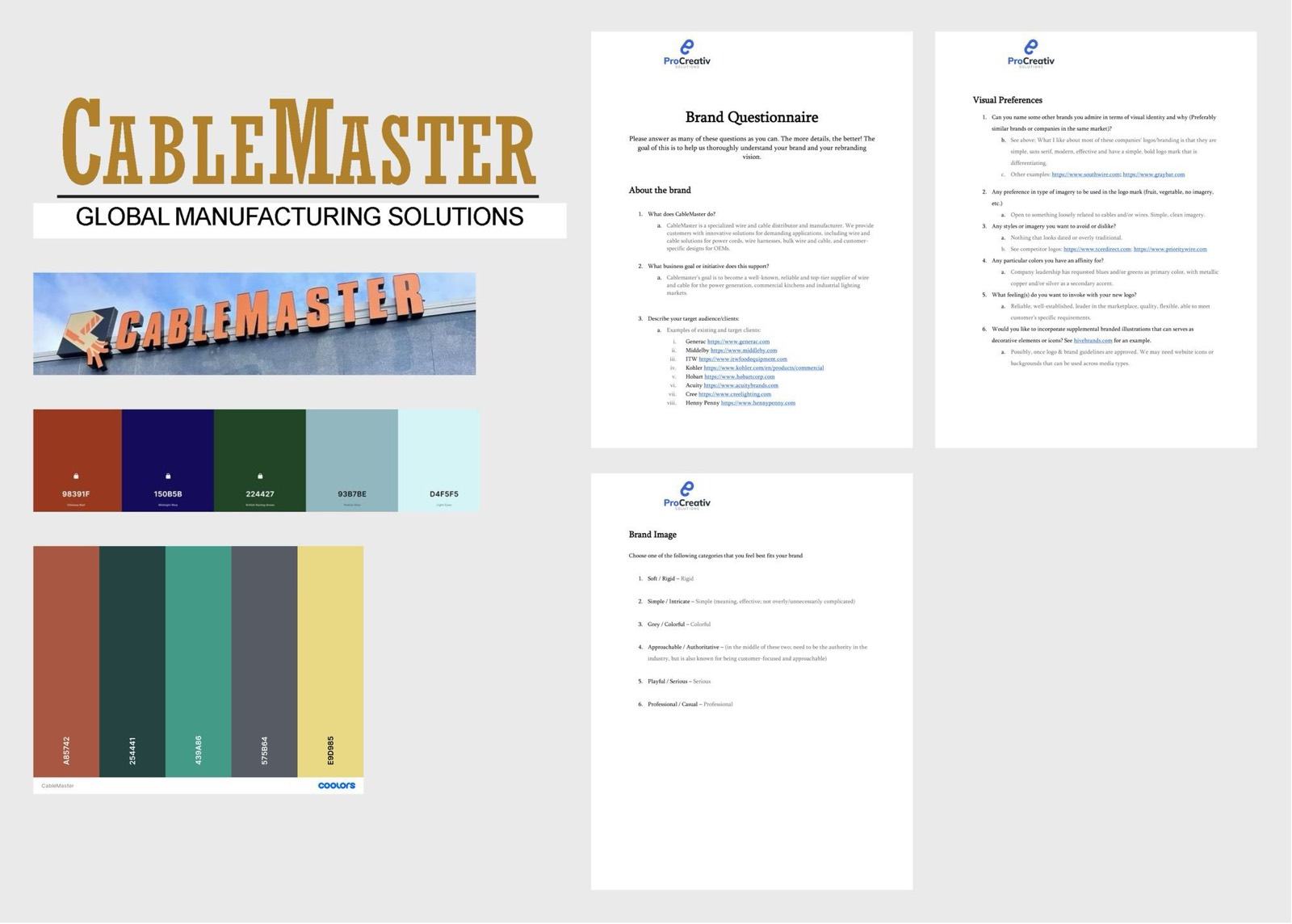
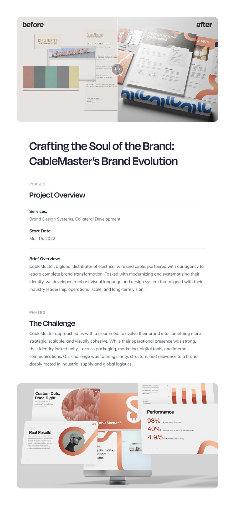
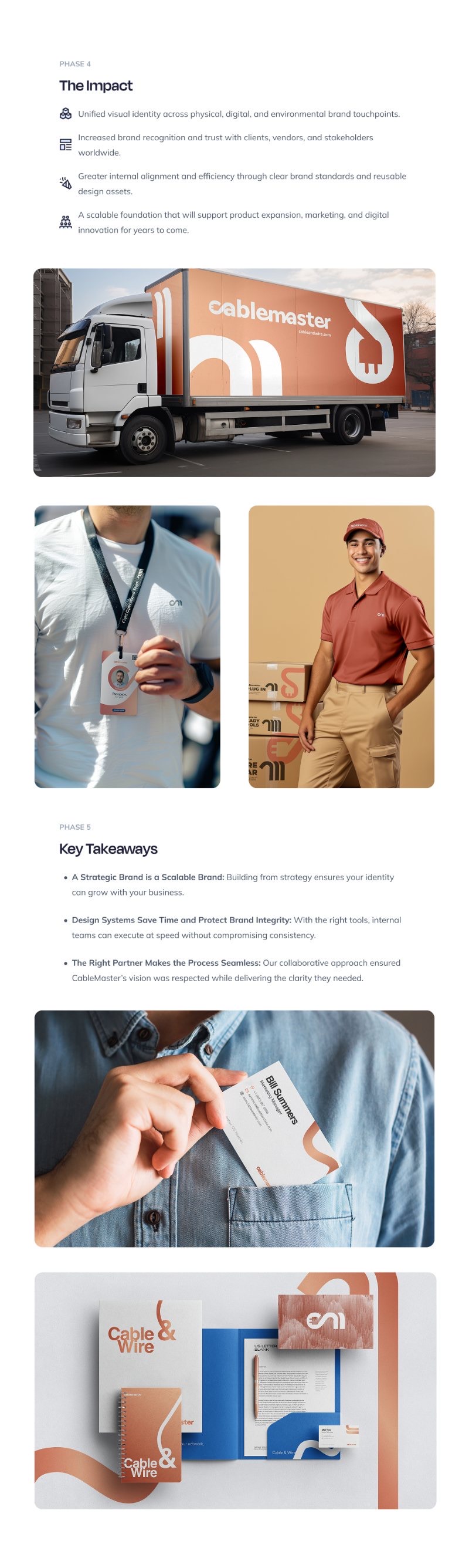
Rebrand · 2025CableMaster's legacy brand undersold a serious manufacturer. We rebuilt it from first principles, positioning first, then mark, palette, type and applications, into an identity that can carry the company into markets the old brand couldn't enter. Drag the handle: the distance between the two is the argument.